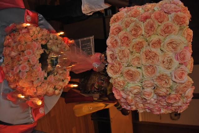
Today, I have the last post in our TUM 2011 series! Today we are FINALLY going to show you what OUR showcase had to offer! We were quite popular if I do say so myself, LOL! We did two completely different looks but used the same exact color scheme. One display used a LOT of florals, had a very romantic feel, and was just what some may say "over the top". This was an example of a higher end table arrangement. The other display was for the bride who may not have a large budget, or the bride who is not a big fan of floral arrangements but still wanted something glamourous and beautiful! Tell us what you think!
 |
| This is how it looked when we FIRST started setting up, loll! |
 |
| Our Logo and Card Table |
 |
| The Floral Filled table |
 |
| Yesss our chairs had on dresses! Loll! |
 |
| The blinged out table! |
 |
| I am personally a huge fan of the lampshades!! |
Which arrangement did you like the best?? Are you a big floral person?? Talk to us, lemme know what you think!
Stay Beautiful My Loves,
Memi
Pin It Now!


2 comments:
Everything looks simply divine!!!
this is awesome
Post a Comment